Landing Page Best Practices
Let’s face it, building a high-converting landing page can be a daunting task and more often than not, we are left with pages which drive only a few to no leads. Great landing pages are usually what stands between you and conversions.
We have identified a few key components and best practices for a highly-optimized landing page which maximizes conversions.
So before you hit publish, take a quick look at the list below and make sure you tick them off.
Descriptive Headline
Your headline needs to be descriptive and compelling. If the headline doesn’t grab the attention of the users in the first few seconds, they will leave immediately. Remember, the user takes about 3 seconds to decide whether they want to stay on the page and consider the content for consumption or not.
Hence the headline should have the following features:
- Clarity – Specific liners that describe the offer
- Relevance– Should be in alignment with the ad copy
- Empathy – Should be directly addressing a user problem, generally use terms like “You” and “Your”
Great Imagery
It is said that the human mind processes images 60,000 times faster than text. Using great imagery helps engage the user and keep them from leaving the page. Images help improve visual appeal, increase the human touch by using people in the images, snapshots of the product or feature and direct user attention to the Call-to-Action.
The thumb rule is to NOT present your landing page as a wall of text and instead include images (or videos) which align with your message.
Engaging content
The user will typically spend a few seconds to skim through the content of your landing page, therefore it is crucial to have highly engaging and easily scannable copy. The content of the page is the main body that elaborates the headline and describes the offering in detail. The length of the content is dependent on the target audience for whom the page is built, across the AIDA Journey (Awareness, Interest, Desire and Action).
Awareness – The content can be a short gist of the offering -e-book, whitepaper, checklist etc.
Interest; Desire – The content should be of medium to long format with details about exclusivity of the content, major takeaways of the content, how users can use the content etc. It is better to give a snapshot of what the user can expect out of the resource .
Action – The most important part of user journey. This is where the user commits to the offering. It is important to be very comprehensive and provide all the information the user needs to act upon.
Concise Form
It is ideal to get just the basic information from users. Forms with fewer fields tend to convert far better than ones with too many fields.
Forms on Awareness, Interest and Desire level landing pages should be shorter, reducing the friction to fill the form, while pages involving purchase can be used to collect all the detailed information to transact.
The form must be located in the prime area of the landing page so that it cannot be missed. It is generally a best practice to have the Lead Capture form or a button that leads to the Lead Capture form above the fold and always in the view of the user.
Directional Cues
The user needs to be directed to the next step while they are navigating the landing page.This will reduce the number of the breaks in navigation and improve the conversion rate for the landing page.
Following are some of the examples for directional cues in a landing page:
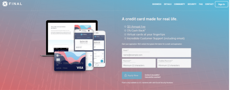
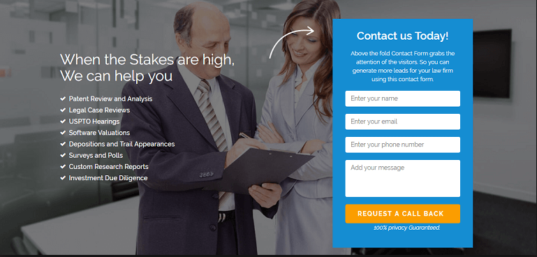
Eye-direction cues on landing pages take into account our unconscious attraction to people’s faces. If there is an image of a person on the landing page then our eyes automatically gravitate toward the image first and then to where the person is looking.
Your attention gravitates towards the center of the page because of the way the two guys are positioned
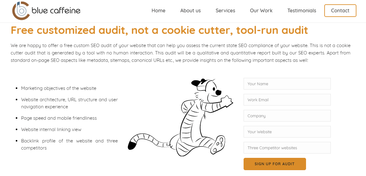
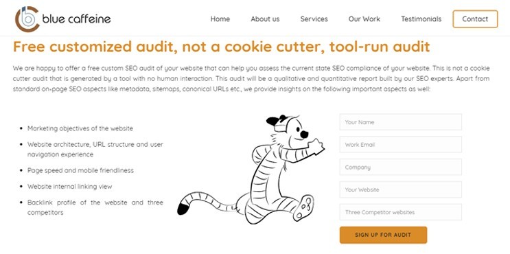
Similar to eye-direction cues, having a object/model gesture toward an important element gets visitors to focus on that area.
Hobbes is running towards the form which in turn prompts the user to look at the form
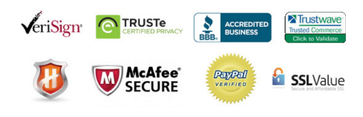
Trust Indicator
Your landing page needs to establish trust and credibility. These often help visitors reinforce their decision to fill in the form or just click on the CTA button. Some of the well-known trust indicators are:
- Social Media outlinks to the brand
- Privacy Policy – Assuring the user that the data won’t be shared with any unwanted parties
- Awards and Recognition – Endorsing the brand’s trustworthiness or website’s security
- Client logos – Brands that the company has worked with
- Real Customer Testimonials
- 3rd Party Seals
Clear Call-to-action Button
CTA (Call-to-Action) buttons are undoubtedly the most important part on your page. The location of the CTA button must always be visible to the user, right from when the user lands on the page.
- The color of the CTA button must be unique, must stand out on the page and be in contrast with the background of the page, so that it’s hard to miss.
- The Text of the CTA button must clearly mention the benefit to the user like “Get the Free E-book”, “Improve your Efficiency”, “Convert more Customers”, “SignUp for Free Demo”, “Sign Up for 45-day Free trial” etc., based on the objective of the page.
Outgoing Links - Logo, Header, Footer
There are two different schools of thought regarding outgoing links on a landing page. Landing pages are very contextual in nature and the approach to optimize should cater to the context.
Thought 1:
There should not be any other links on the landing page that will take away the users from conversion. This will improve conversion rate.
Thought 2:
There can be links to other pages that can give more information to the users thereby improving engagement and chances of conversion on any page.
Both thoughts are true depending on the objective of the landing page. It is important for top and middle level landing pages to not have any outgoing links, as the primary objective is to capture the contact details of the user.
For bottom level landing pages which involve purchase or transaction there can be outgoing links. But that too must be kept at a minimum.
Page Layout Pattern
The layout of the landing page is the most subjective aspect of any brand. The design and layout depends on how the designer understands the user experience understanding of the page. Certain studies have shown that users follow set patterns like the “F- Pattern” or “Z-pattern” while consuming content and it has been proven that designs that follow these patterns have a higher probability to convert
F-Pattern
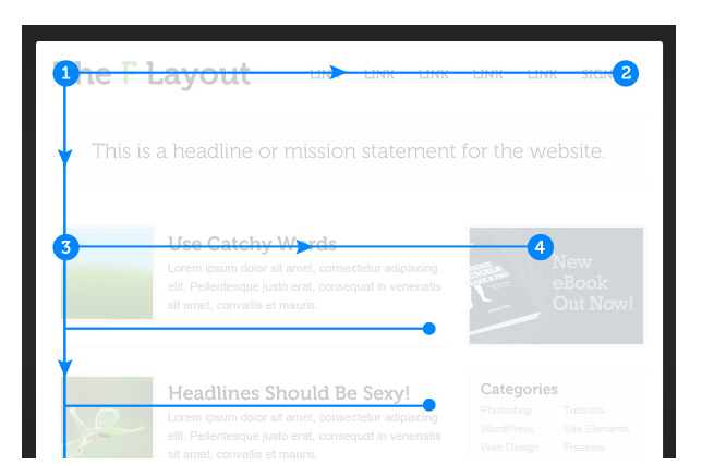
At first, the viewer’s eyes move horizontally across the top of the page to read important headlines. Next, they proceed vertically down the left side of the page to view other notable page elements like numerals or bullet points.
Lastly, they zip across the page again to read any bold text or sub-headlines.
It is best practice to have long-form content pages to be designed in F-pattern layouts to improve engagement.
Z-Pattern
First, readers look from the top left to the top right, forming an imaginary horizontal line. Next, their eyes move down and to the left side of the visible page, creating an imaginary diagonal line. Lastly, they head back across to the right again, forming a second horizontal line. When viewers’ eyes move in this pattern, it forms an imaginary “Z” shape.
Landing pages that convey point-to-point information and concise information can benefit from the Z-pattern layout. A CTA button or image or directional cue can prove to be very powerful when used at the turning points of Z-pattern, improving page engagement